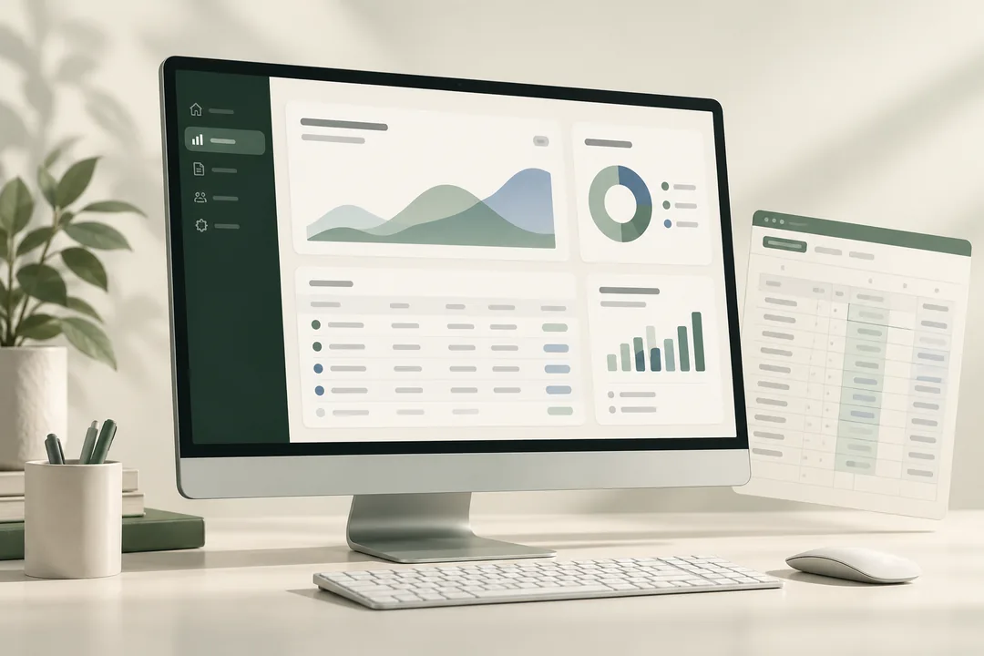
Use a spreadsheet when a small team needs familiar editing and straightforward summaries. Consider a custom dashboard when people need a consistent view with a few useful filters. Start with the decisions and data quality; choose the software second.
Choose the smallest useful version
A dashboard is worthwhile when it helps someone decide what to do. If nobody can name that decision, another chart will probably add noise. Ask: what changes when this number goes up or down, and who acts on it?
| Need | Good first option | Check before choosing |
|---|---|---|
| Edit and correct rows together | Shared spreadsheet | Access permissions and an owner for formulas |
| Summarize one export by category | Pivot table or report tab | Consistent dates, categories, and numeric columns |
| Give readers a focused, repeatable view | Custom dashboard | Metric definitions and useful filters |
| Combine systems and refresh automatically | Separately scoped integration | API access, ongoing costs, failure alerts, and maintenance |
Google Sheets pivot tables can group and summarize a source range using calculations such as counts, sums, and averages. They can be enough for an initial reporting workflow. Google’s pivot-table documentation explains the underlying options.
Prepare one trustworthy input
Keep the original export unchanged. Make a separate working copy with one header row and one record per row. Describe what a row represents: an order, invoice, project, or weekly category total. Those are different units and should not be counted interchangeably.
- Choose the date field and reporting period.
- Name the currency and whether amounts include refunds, tax, or fees.
- Identify a stable record ID and decide how duplicates are handled.
- Label missing information instead of silently replacing it with zero.
- Remove personal or confidential fields that the report does not need.
Use the free CSV checker to inspect blanks and repeated rows locally. Its checks do not prove that a business total is correct; reconcile that separately.
Test the dashboard against the source
Our fictional studio dashboard contains six summary rows. With all filters selected, it shows 18 orders and $18,600 in revenue. The average order value is $18,600 ÷ 18, or $1,033.33 after rounding. It is not the unweighted average of each row’s average. Select September 14 and Website: the view should show five orders and $4,500.
This is a demonstration dataset, not client revenue or a claimed business outcome. The useful proof is that a reader can inspect the source, change the filters, and reproduce the result.
- Reconcile the full total to the supplied file.
- Check at least one filtered subset by hand.
- Test an empty result and a missing amount.
- Record the data date and refresh procedure.
- Name who investigates exceptions.
Know what the first package covers
The $750 USD spreadsheet-to-dashboard package covers one supplied table within the stated limits, up to five metrics, two filters, and one view. Live integrations, ongoing refreshes, extensive cleanup, and account access are outside that package. Confirm fit and timing before payment or work.
If exports are inconsistent, start with data cleanup. If the challenge is repeated reporting, use the weekly reporting guide to define the refresh before buying more software.